by Surdej Web Solutions | May 1, 2026 | Website Design
In Buffalo, spring doesn’t just mean warmer weather and longer days. After a long season of snow and cold, it often signals a time to refresh, clean up, and take a fresh look at things, especially at how your business shows up online. A website redesign is one of the easiest ways to keep things feeling current. It helps your site look better, load faster, and work better across all devices. But a smart redesign is more than just picking new colors or swapping out your homepage photo.
If you have been thinking about reworking your site, now is a great time. Before starting any big changes, there are a few things every Buffalo business should keep in mind. From what really goes into a full update to how our local seasons can affect user habits, let’s walk through what a website makeover should include and what to avoid as you plan it.
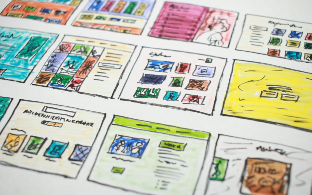
What a Website Makeover Really Means
Website redesign is not just about a new look. It’s about making your site easier to understand and easier to use than before. That usually involves a few different updates working together behind the scenes.
Some of the most common changes include:
- Updating the layout so people can get to important content faster
- Reworking the written content so it’s clearer, more useful, and easier to scan
- Improving how the site works on phones and tablets, not just desktops
Good redesigns also focus on how quickly the site loads and how easily people can move from page to page. If your old layout makes people click too much or scroll too often, that can push new visitors away. A refreshed design, when done right, gives your customers a clear path, whether they want to send a message, make a purchase, or learn more about what you do.
The changes behind the scenes matter as well. A fresh look might catch someone’s eye, but improvements to structure, speed, and readability are what make them stick around. At Surdej Web Solutions, many of our redesign projects use content management systems like WordPress along with SEO-friendly page structures, so it stays simple to edit content and keep each page clear for both visitors and search engines.
When to Know It’s Time for a Redesign
Some signs of an outdated site are easy to miss when you see it every day. But if any of these sound familiar, it might be a good time to take another look:
- The site loads slowly or doesn’t work well on mobile devices
- It feels stiff or difficult to use on tablets, especially for people with limited internet speed
- Customers say they can’t find what they need or leave the site without completing a task
- The content feels outdated, is too wordy, or is no longer accurate
Another signal is if you have recently updated how your business works but didn’t change your site to match that. Whether you have added new services, started offering delivery, or simply adjusted your business hours for the season, these changes need to be clear online. If not, your site may be sending the wrong message, one that does not reflect your current business.
Common Mistakes Buffalo Businesses Make
Website updates often start with good intentions, but planning mistakes can slow the process. A few common patterns tend to cause trouble.
Some businesses focus too much on visuals before considering the user experience. A great design is not helpful if people cannot find the contact page or the site takes too long to load on a phone.
Content updates are often forgotten. Buttons might link to outdated forms, bio pages reference old roles, and locations may have changed even though the map still points to the previous address. These issues can confuse or frustrate people trying to reach you.
Skipping the planning step can hurt your efforts in the long run. Starting a redesign without specific goals, or knowing how users interact with the site, can leave things incomplete. A good project reviews where your customers struggle, asks why, and then improves those areas through design, layout, or updated content.
Make it Work for Buffalo’s Seasons and Audiences
Living and working in Buffalo means knowing that the seasons affect daily routines. Winter here lasts a long time and changes how people browse on the go. Heavy gloves, cold fingers, and slower Wi-Fi in snowy parking lots mean your site needs to work quickly and clearly on mobile, especially when users are in a hurry.
In summer, downtown Buffalo is busier, with people checking schedules or searching for places to eat or shop before an event. Sites should adjust to those habits—quick touch navigation, easy-to-read maps, and fast-loading event info make a big difference.
For local businesses, redesigns are not just about graphics. They are about building a site that works for your real users, in genuine Buffalo conditions. Some questions to consider:
- Is the font large enough to read comfortably on smaller screens?
- Can someone with slow mobile data still use your contact form without difficulty?
- Are seasonal details like weather closings, pickup instructions, or summer hours easy to find?
When your site truly fits how people use it, day to day and season to season, they are more likely to stay longer and consider reaching out.
Built to Grow with You
Good websites do more than serve this week’s visitors. They are planned to grow with your business over time. Thinking ahead is especially useful when redesigning.
Maybe you don’t need online booking now, but want the option for next year. Maybe you are not posting regularly on your blog yet but would like to in the future. These future plans do not need to happen right away, but your site can be prepared for them. When you are ready, updates are faster and easier to make.
A thoughtful redesign helps your site do more over time:
- Expand your services or add new product pages
- Reach new customers in other neighborhoods or counties
- Adapt to changes in how people search and browse
By planning for what is ahead, with a site that changes with you, you avoid having to redo everything in a year. During our redesign work, we also review core elements like page titles, descriptions, and navigation labels so they are set up to support both current and future content without needing to be rebuilt from scratch.
Built for Buffalo, Built for Better
Spring cleanups are not limited to the office or shop front. Sometimes your digital space needs a reset as well. A fresh website helps people find what they need faster, understand your business more clearly, and stay longer than before.
In Buffalo, where snowstorms turn into busy walking seasons and frost covers the ground before dinner, your website needs to handle whatever comes. When local habits meet clear design, your message comes through. Starting with clean structure, thoughtful content, and enough flexibility to grow, a refreshed site helps you through each season.
Not sure where to start with your updates? We can help you decide what matters most for your goals and your customers. A well-done website redesign can improve your layout, provide better page structure, and make your site easier to use throughout the year. We design with your growth in mind so your changes today will be future-ready. Ready for a reset? Contact Surdej Web Solutions to talk about your next steps.

by Surdej Web Solutions | Apr 24, 2026 | Search Engine Optimization
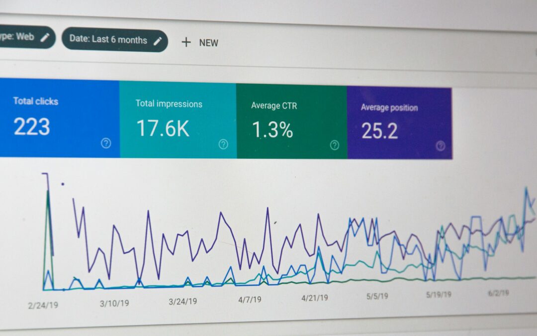
Sometimes a website looks nice, loads fine on a desktop, and feels complete. But then traffic drops, or fewer people seem to find it online. That’s when those small, hard-to-spot mistakes start to matter. A shiny homepage won’t help much if the parts under the surface are off. Little problems with how a site is built can quietly push it down in search results.
That’s where on-page SEO services become helpful. They focus on fixing issues that mess with how search engines understand your pages. And when search engines struggle, so do potential visitors trying to find you. In this post, we’re talking about common on-page SEO mistakes that slowly chip away at your traffic and what steps we can take to clean them up.
Why Does On-Page SEO Even Matter?
On-page SEO is simply how a page is set up so that search engines can read it clearly. It includes things like the text, titles, links, and images found on each page. If those pieces are done well, search engines understand what the page is about and who might want to see it. If they’re off, the page might get skipped.
What makes this important is how people use search engines. When someone looks something up, they usually don’t scroll far. If your site isn’t listed near the top, it might not be seen at all. A small fix in your title, an update to how a page loads, or better wording in a heading can make a difference.
We want each page to line up with what both users and search engines expect. Something as simple as using the same phrase your customers search for, or making sure your text is easy to follow, helps more than it might seem.
Your Page Titles and Headings Might Be Off
The titles and headings on your site work like road signs. They guide readers and tell search engines what’s happening on the page. If these signs are missing or confusing, it’s harder for both people and bots to figure things out.
There are a few places where page structure gets messy. A title might be too vague. A heading might not match what the paragraph says. Or there is a jump from a large heading to another one without anything in between. These problems do not crash the site, but they throw off how readable and useful it feels.
One way to start improving is by looking at how the headings are ordered. A clear H1 at the top, followed by smaller headings under each topic, makes it easier to scan and understand. It also helps search engines follow your ideas from top to bottom. When your titles and headings tell the right story, people stick around longer.
Too Many Keywords or None at All
Some pages are packed full of the same word or phrase. Others barely mention what they’re about. Both ends of that spectrum can hurt search rankings. If a page is stuffed with keywords, it sounds fake. If it doesn’t use any, search engines won’t know what it offers.
A better way is to write for people first. Use words that feel natural but still include terms people might search for.
For example, if we are offering on-page SEO services, we do not put that phrase in every line. We write clearly about topics that relate, and the search terms fall into place.
Think about what someone might type into a search bar. Then check your page. Are those words in the title, in a heading, or deep in the middle of a paragraph? Making small updates to how often and where those words show up can help balance the page in a way that works.
Forgot About Mobile and Spring Browsing
By late April, people are outside more. They’re in coffee shops, parks, and parking lots, checking their phones. If your website still looks best on a desktop, you might be losing people quickly. Mobile use climbs in the spring, especially in places that are cold most of the year. That makes clean, mobile-friendly design more important than ever.
When a site doesn’t work well on a phone, it shows fast. Images might stretch too wide. Buttons might be too close together. A full menu might take up the whole screen. These issues are not just annoying, they often cause visitors to leave without reading anything else.
Making the site easier to use on smaller screens helps with search rankings too. Search engines notice when visitors click away quickly. Websites that load fast on all devices and are easy to use with one thumb and don’t freeze up in weaker signals tend to do better. Fixing mobile issues connects better with people, especially in the spring when browsing gets shorter and faster.
Missing Meta Descriptions and Image Tags
Meta descriptions and image tags are not always visible while reading the page, but they are important parts of how search engines learn about it. When these are missing or copied from page to page, the page can get skipped over in search results.
Let’s say someone is looking up cleaning services in their area. The blurb under the link in their search results: that’s the meta description. If it’s not filled in or doesn’t describe the page well, people might scroll past you. Even worse, the search engine might grab a random sentence from your site that doesn’t help at all.
Image tags work in a similar way. They describe what’s in a picture. If every image on the site is just called “image123,” search engines won’t know what the picture is about. Tagging a photo of cleaning supplies as “spring cleaning tools” is more useful.
Making time to fill these parts out gives each page a better shot at getting found.
Make Your Website Easier to Find and Use
On-page SEO is not about fixing one big thing. It is about finding a lot of little things hiding in plain sight that end up making a bigger difference than you would expect. If any of these are off, they can slow traffic and confuse both real visitors and search bots.
We see the best results by treating our site like a tool, one that needs minor tune-ups over time. When we adjust titles, check content flow, fix mobile bugs, and clean up tagging, more people find the site and stay longer. That kind of steady progress helps traffic grow without the need for quick fixes or guesswork.
Tired of guessing why some pages get buried in search results while others shine? Our team can help sort out the details that really matter. Our process focuses on the structure, clarity, and flow of every element so that your website works seamlessly for both people and search engines. With thoughtful content updates, smart design adjustments, and cleaner page elements, potential customers can find you more easily. We offer targeted help through our on-page SEO services to ensure your pages are in top shape. Contact Surdej Web Solutions today to get started.
by Surdej Web Solutions | Apr 17, 2026 | Website Design
A lot of business websites still look great on a desktop, but once they’re opened on a phone, the cracks start to show. Buttons overlap, pages scroll sideways, and loading takes too long. That might seem like a small issue, but it’s not, especially during spring in a place like Buffalo, New York. People are on the go more, searching for local spots while sitting outside, driving around, or looking up something quickly between errands.
When a site doesn’t match how people use their phones, it doesn’t matter how nice it looks on a computer. You end up turning away visitors who would’ve stayed if the site worked better for them. That’s where the right kind of help comes in. A responsive website design company can spot those gaps and fix them, making sure your site works no matter what kind of screen someone’s using.
Let’s break down what local shoppers expect, what’s pushing them away, and what your site might be doing that’s costing you clicks.
What Buffalo Users Expect on Mobile
When spring hits in Buffalo, the streets feel different. Coats come off, patios open back up, and people get outside. That’s when phone time goes up because no one’s tied to a desk anymore. They’re standing in line for coffee, sitting at the park, or walking through a store, checking websites in quick bursts.
From what we’ve seen, here’s what those mobile users are looking for:
- Quick loading pages that work smoothly without Wi-Fi
- Easy-to-use menus that don’t need zooming or pinching
- Search bars that are clear and fast to tap
- Answers right away, like business hours, services, or locations
When people can’t find what they need fast, or if a site looks messy on their phones, they back out. It feels more like work than help, and that’s usually the end of that visit.
Common Website Problems That Push Buffalo Buyers Away
Most people won’t tell you when your site is tough to use. They just stop visiting. And in the spring, with the weather bouncing between damp mornings and warm afternoons, mobile users want things to work the first time they try.
We keep seeing the same problems repeat across older or outdated websites:
- Tiny text that people have to squint or zoom to read
- Buttons and links stacked too close, so they tap the wrong one by accident
- Screens loaded with pop-ups or oversized photos that don’t scale well
- Pages that get stuck or freeze during spring storms or spotty outdoor connections
These are quiet blockers. They don’t crash the site, but they chase off potential customers. If something takes more than a few seconds to figure out, people give up and look somewhere else.
Why “Looks Fine on Desktop” Doesn’t Cut It in Spring
We hear it all the time, “It looks fine to me on my computer.” But that’s not where most people are viewing your site anymore, especially once we hit April. People in Buffalo are fixing things up, planning for summer, and spending less time at their desks. Their phones become their shopping hub.
During this time of year, people check your site fast and if it doesn’t load correctly on mobile, they move on. Even a sharp-looking homepage on desktop can feel clunky and outdated on a phone or tablet.
That’s one of the big reasons we rely on experience from a responsive website design company. It takes more than shrinking a site down to fit a phone. It means building a layout that adjusts smoothly no matter the size of the screen. Whether someone visits from a laptop at home or a phone in a parking lot, the experience should feel familiar and easy every single time.
Ways a Local Site Can Meet Buffalo Users Where They Are
A good website for Buffalo customers thinks ahead to what they’ll need around this time of year. By April, people are ready to clean, plan, and buy, and they’re often doing it right from the sidewalk or the driveway.
Local shoppers appreciate when a website actually fits into how they live. Here are a few ways we’ve seen business pages really connect:
- Show up-to-date info on spring offerings, from outdoor cleanups to warm-weather events
- Add a quick toggle for local pickup, or highlight services that make sense for this season
- Make sure operating hours, maps, and contact buttons all work without pinching or scrolling
- Clean up the design so it loads fast, even with weak mobile reception
Keeping things simple helps people finish what they came to do. If someone is just trying to check your hours or see if a product is back in stock, the website shouldn’t feel like a math test.
Built to Fit Real Customers, Not Just Screens
Websites aren’t just for showing off your brand, they’re supposed to work for the people using them. The best ones stay out of the way. They let visitors scroll, tap, and move through pages without thinking twice.
When we build with real users in mind, the result feels better all around. Buffalo shoppers appreciate when it’s easy to browse or buy, especially during the busy spring stretch. A thoughtful site makes a difference. It shows people they were considered when the page was built.
Staying ready for mobile isn’t about being trendy. It’s about matching your website to real-world behavior. That kind of match makes the whole experience easier, smoother, and a lot more likely to keep people coming back.
Website issues on mobile, especially during busy spring times in Buffalo, might cost you more than you think. Small design problems lead to missed customers and lost sales, and fixing them takes more than guesswork. We focus on helping businesses spot these issues and deliver better user experiences across every screen size. For support from a trusted responsive website design company, Surdej Web Solutions is here to help. Contact us to start making your site easier for real people to use.
by Surdej Web Solutions | Apr 10, 2026 | Website Design
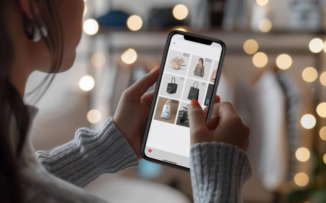
Now that spring is starting to show up across much of the country, a lot of people are turning their attention to seasonal shopping. They might be outside more, fixing up their yards, cleaning out garages, or planning events. And you can bet they’ve got their phones nearby while doing it. If a local business wants to sell online, making sure their ecommerce website design is mobile-friendly gives them a huge head start.
When shoppers land on a website that’s hard to use on their phones, they usually don’t stick around. But when a store loads fast, looks clean, and feels easy to tap through, it puts them at ease. They can scroll, browse, and buy without frustration. We’ve seen how those small details make all the difference, especially when people are on the move and shopping in short bursts during the day. That’s what this post is meant to help with, getting your online shop ready to work well on mobile before buyers give up and walk away.
How Mobile Layout Impacts the First Impression
People decide fast if they like a website or not. On a phone, that first impression hits even quicker. If a page is jammed with text, hard to scroll, or filled with overlapping shapes and buttons, most of us will back out without a second thought.
Clean layout matters, and here’s why:
- It shows that some thought went into the design
- It gives a sense of order, even before reading anything
- It helps users feel calm, not rushed or frustrated
We suggest sticking to one main color with just a second or third to help guide the eye. Keep spacing wide enough so fingers don’t click the wrong thing by mistake. Avoid cramming everything into the top part of the screen, and let the page breathe. This makes visitors want to keep going, not leave. A well-structured layout starts people off on the right foot.
First impressions matter, especially when it comes to online shopping. Many shoppers base their decision to stay or leave almost entirely on those first few seconds after landing on your site. If your website’s mobile layout feels cluttered or overwhelming, it sends the wrong message. On the other hand, if the design feels open, fresh, and easy to read, people feel at ease and are more likely to stay. A simple, straightforward layout eliminates anxiety and builds trust with your visitors before they ever see a product or read a description.
Navigation That’s Easy to Tap and Use
A huge part of mobile-friendliness comes down to basic movement. Can people find stuff without getting lost? Can they tap links without zooming in or missing the target?
Phone screens don’t leave much space. That means clutter is not your friend. Sites with too many drop-downs or stacked buttons usually feel confusing. To fix that, we like to keep things simple:
- Use short words on your menu so they’re easy to read at a glance
- Put the most-used links in one easy-to-reach place
- Space out your buttons so people don’t tap two things by accident
And always make sure the cart, search box, and customer login are easy to locate. When a screen is small, fewer steps feel better. Smart navigation turns that tiny screen into a tool, not an obstacle.
Navigation that works well for mobile users is also about helping people feel in control. No one wants to get stuck in a confusing maze when shopping online, especially when browsing on a phone. Poor navigation can leave shoppers feeling stuck and frustrated, which leads them to leave the site without making a purchase. Offering a straightforward, touch-friendly navigation experience keeps users focused on shopping rather than struggling to get where they need to go.
Loading Speed Matters When Everyone’s on the Go
We’ve all been there. You tap a product link, and the site just spins. Nothing kills the mood faster than a slow page. People don’t wait around, especially when they’re shopping from their phones in quick moments between tasks.
So we keep speed top-of-mind when building or updating a mobile site. Most slowdowns come from oversized pictures, clunky pop-ups, or code that’s been patched together too many times. When planning for mobile, we cut back on extra weight.
Here’s what helps most:
- Shrink image sizes so they still look good without taking forever to load
- Skip autoplay banners or large video headers on mobile
- Clean up old code that might slow down the background
A fast site gives visitors more reason to stay. Instead of waiting around, they move through pages smoothly and are more likely to make it to checkout.
Loading time can directly impact your sales, especially in a season like spring when people are constantly multitasking. If customers are outside or on cellular connections, every second counts. A page that loads quickly encourages users to browse more products, add items to their cart, and complete the checkout process without any speed bumps getting in their way. Speed is one of the easiest things to improve, but also one of the most often overlooked by online stores.
Spring in Buffalo Means Moving Quick, and So Should Your Site
By early April, the snow in Buffalo, NY, is usually melting away, and people are ready to come outside and get things done. Whether they’re planting gardens, fixing roofs, or planning weekend road trips, their phones are on standby. That’s the window when fast, mobile-ready websites really pay off.
When seasonal energy picks up, shopping habits change too. People are more likely to:
- Do quick scans for deals while walking the dog or sitting in the passenger seat
- Look for local pickup or events they can visit in person
- Click on spring discounts tied to outdoor gear, home cleanup, or warm weather plans
If you’re hoping to catch those eyes, your site should highlight those spring options clearly. Make your seasonal specials easy to spot and even easier to buy. Browsers don’t browse very long, especially on mobile, so showing the right stuff fast makes all the difference.
Seasonal energy in places like Buffalo brings shoppers outside, with mobile in hand and limited time to shop. That’s when clear, attractive formatting is especially key. If your site quickly shows spring-related deals, services, or in-person pickup options, customers are more likely to stop scrolling elsewhere and stick with your store. Connecting with the local buzz, even through small tweaks, makes your ecommerce shop feel not just functional but truly part of the community.
The Right Mobile Start Builds Customer Confidence
Good ecommerce website design isn’t just about where something lives on the page. It’s about how people feel when they use it. If someone opens a site on their phone and everything runs smoothly, they trust what they see. They relax, they scroll, and might even buy something without a second thought.
That kind of comfort doesn’t happen by accident. It takes a mobile setup that puts people first, clear menus, fast screens, simple touches. During busy spring months, when shoppers in places like Buffalo are eager to get going, that kind of design helps your business meet them where they already are. On their phones. Moving fast. And ready to buy.
Trust is essential when it comes to ecommerce, and mobile users crave an experience that feels seamless and straightforward. When your website anticipates needs by offering clear prompts, logical ordering, and fast navigation, shoppers can relax and focus on what matters, finding the right product for their spring plans. This starts from the very first tap. Establishing this trust early makes all the difference throughout the season, since happy customers return and may even share your site with others.
We build sites that make that match easy. A smooth design makes your store feel familiar from the very first tap.
Thinking of updating your mobile shop before the spring rush hits its stride? We are here to help you stay ahead. A smooth layout and fast performance make all the difference when buyers browse on their phones. We know what works best when it comes to clean, simple design that puts users first. Take a closer look at how we approach ecommerce website design built for Buffalo businesses and reach out to Surdej Web Solutions to get started.

by Surdej Web Solutions | Apr 3, 2026 | Website Design
When someone lands on a website, it takes just a moment to form an opinion. That quick reaction often decides whether they stay or click away. And a lot of that reaction comes down to how the website looks and feels.
A clean, well-organized layout tells people the business is serious and professional. Poor design does the opposite. Professional web design isn’t just about making things look nice. It helps people feel confident, and that matters more as we move into spring. Warmer weather often gets people thinking about local services, home updates, or seasonal purchases. If your site feels fresh and easy to trust, it gives those new customers a reason to stick around and look more closely. A strong first impression is the foundation for building long-term customer relationships online.
Why First Impressions Online Matter
It doesn’t take long for visitors to decide whether they trust what they’re seeing. Most of the time, it happens before they even finish loading the homepage. Those first few seconds set the tone for everything that follows by giving visitors immediate feedback about your business.
Here’s what can shape that first impression in the wrong direction:
- Cluttered pages with too many things competing for attention
- Old designs that feel like they haven’t been updated in years
- Broken images or text that’s hard to read
Even if the business behind the site is great, people might never find out. They’ll click away before reading a single paragraph. A better approach is to start strong with good design. A site that feels welcoming, calm, and easy to follow gives your visitors a smooth start. The right design choices make everything feel more trustworthy from the first moment they arrive. Making the right first impression creates an atmosphere that encourages people to stay, explore, and perhaps become customers. It’s not just about colors or fonts, it’s about how visitors feel when everything loads as it should, looks complete, and works smoothly across devices. Your homepage should guide users gently, letting them know what you do and inviting them to take a closer look.
The Role of Design in Building Credibility
After that first impression, people start scanning for tiny signals. They look for signs that you’ve put care into how the site works and how it’s presented. That’s where design details matter. Well-organized content makes finding information simple and enjoyable, leading visitors to trust your business and its offerings almost automatically.
There are a few ways design shapes how credible your business feels:
- Matching colors and styles across every page so the site feels steady
- Simple menus and clear buttons that make things easy to click on
- Well-chosen photos that feel relevant and reflect what you do
When everything lines up, it gives the sense that nothing was rushed. People pick up on that. A polished website helps build quiet confidence. It doesn’t need big promises. The way it functions speaks for itself. And that’s something customers remember. Every small detail gives proof that you care about your online space, and by extension, about your customers as well. Having a design that feels finished and thought-out can set you apart from competitors who may have neglected these details. A consistent visual theme ties everything together and keeps visitors comfortable as they move from page to page, while clear directions and helpful prompts give them confidence that they’re using the site the right way.
How Good Design Helps People Feel Safe
Trust isn’t just a feeling. It’s often tied to how information is shared and how easy it is to take action. Visitors want to know they’re in the right place, and that it’s safe to move forward with their next step, whether it’s browsing products, requesting a quote, or reaching out with questions.
A few design choices that help people feel more secure include:
- Placing phone numbers, hours, and addresses in places that are easy to find
- Keeping page layouts clean so users don’t feel overwhelmed
- Including privacy messages or bits of copy that explain what happens next
Another big one is mobile-friendly design. Most people aren’t sitting at a desk when they look up a business. Instead, they’re checking out websites while on the go, making it especially important for your site to look and work well on smaller screens. If your site adjusts smoothly to a smaller screen, it shows that the business is paying attention to what people actually use.
Trust grows when people can find details without guessing where to click. Strong design makes that experience feel smooth and natural. When navigation is simple, users feel at ease, knowing they won’t get stuck or lost. Being able to quickly find operating hours, services offered, or contact details helps remove hesitation. Showing little signs that their information is handled with care, like privacy statements, also goes a long way. When potential customers see that everything works as expected and they can interact easily, they naturally feel safer and more likely to stick around.
Local Users in Buffalo Look for Signs of Trust
Spring in Buffalo usually brings a shift in energy. Snow melts, daylight sticks around longer, and businesses begin setting up for outdoor traffic. The city wakes up as people get out more, run errands, and plan new projects or purchases for the warmer season. For businesses in Buffalo, this seasonal change means more people are searching online for services, home improvements, fun activities, and other ways to make the most of their spring.
Customers respond to that shift by increasing their searches for services, home improvements, and seasonal events. This is a busy time when visitors may be looking for local businesses they can trust for those spring and summer needs. When someone from Buffalo lands on a website, they’re often looking for signs that the business knows the area and is ready for the season.
A few design touches can make a big difference:
- Updating business hours for spring or summer
- Sharing seasonal promotions or services on the homepage
- Featuring photos that reflect the current weather or local scenery
Even small updates, like refreshing a banner image or adding a spring message, can show that the site is active and up to date. Including local reviews or service areas gives nearby customers a stronger sense of connection. Not every visitor says it out loud, but they notice when a website feels local and current. Highlighting community involvement, showcasing local partners, or referencing familiar landmarks in photos can also help create a sense of belonging. People like to do business with companies that feel close to home, especially when the seasons change and everyone is looking ahead to what the next few months will bring. A current, location-aware site reassures visitors that your business is in tune with what’s happening around them.
Building Trust Starts with Good Design Choices
Trust online doesn’t come from a single feature. It builds over a few seconds as everything on the screen works together. The more comfortable someone feels while using your site, the more open they are to reaching out or learning more. Every part, from the images chosen to the words on each button, collectively shapes what visitors think and feel.
Great design helps move things forward without asking for effort. Visitors land, scan the page, and feel like everything makes sense. Their questions are answered quickly, and nothing seems out of place. That simplicity sticks with them. It makes visiting your site enjoyable, not confusing or overwhelming, and that is often enough to encourage them to stay longer or contact your business.
When a site feels polished and friendly, it tells people their time is respected. And businesses that build that kind of experience set themselves apart in ways visitors remember. It’s not just about how the site looks, but how it makes people feel when they use it. That’s the kind of trust that takes root and grows over time. Choosing thoughtful design is about thinking ahead for your users and making each visit easy. Good design means problems don’t get in the way, and customers are left with a lasting impression that encourages future visits and positive word of mouth.
At Surdej Web Solutions, we know how important it is for local businesses to make a strong first impression online, especially during the busy spring season. A thoughtful design helps users feel welcome, confident, and ready to connect. If you’re aiming to build trust from the start, our approach to professional web design can play a big role in how customers see your brand. Clear navigation, consistent visuals, and a mobile-friendly layout bring it all together. Reach out to us to talk about what your site needs this season.
Recent Comments